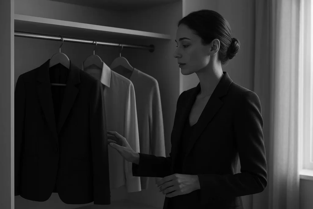
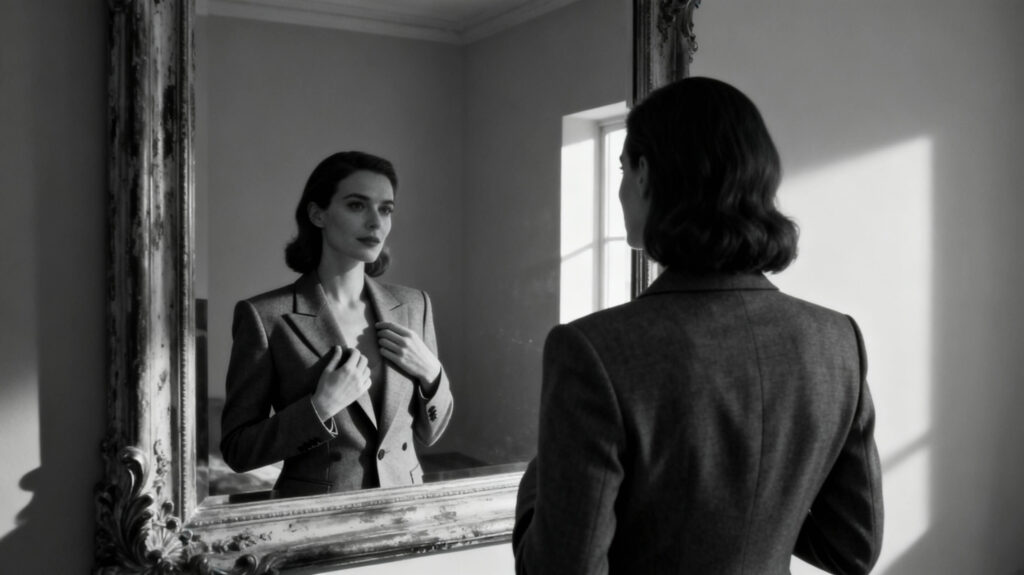
Have you ever tried on a dress in a color that seemed to instantly illuminate your entire complexion, making your eyes sparkle and your skin glow? Conversely, have you worn a color that left you looking tired or washed out, no matter how beautiful the piece itself was? This is not a matter of chance; it is the science and art of color theory at play. For the discerning woman, understanding luxury color theory is the secret to making truly intelligent and impactful fashion investments.
Choosing a designer piece is about more than just the label or the trend; it’s about how that piece makes you feel. The right color has the power to enhance your natural beauty, project confidence, and ensure your luxury investments work harder for you. This guide will demystify the principles of fashion color analysis, helping you to identify your unique skin undertone and build a wardrobe of designer pieces in colors that are not just beautiful, but are beautifully, authentically you. Welcome to the art of wearing color with intention.
Section 1: The Psychology and Power of Color
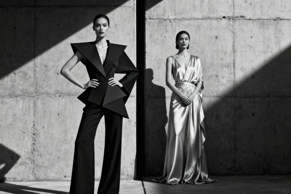
Before we delve into the technicalities of undertones, it’s essential to appreciate why color is so powerful. Color is the first thing the human eye registers, and it is a potent form of non-verbal communication. The colors you choose to wear can influence not only how others perceive you but also how you feel about yourself. A vibrant red can evoke feelings of power and passion, while a serene blue can project calm and trustworthiness.
In the realm of luxury, this becomes even more significant. The luxury lifestyle values precision and intention, and a well-chosen color palette is the hallmark of a truly considered wardrobe. When you wear a color that harmonizes with your natural complexion, the effect is seamless and powerful. It creates a visual harmony that suggests confidence and an innate sense of style.
This is the core of designer clothing psychology: selecting pieces that feel like a natural extension of yourself. It is the difference between simply wearing a beautiful dress and becoming the woman who looks effortlessly radiant in it. Mastering your personal color palette is the ultimate expression of self-expression through style, ensuring that every piece in your wardrobe not only fits your body but also flatters your unique beauty.
Section 2: The Foundation: Identifying Your Skin’s Undertone
The most common mistake in choosing colors is confusing skin tone with skin undertone. Your skin tone is the surface color of your skin (e.g., fair, medium, deep), which can change with sun exposure. Your undertone is the subtle, permanent shade of color beneath your skin’s surface. It is the key to discovering your most flattering color palette. There are three primary undertones:
-
Cool: Pink, red, or bluish undertones.
-
Warm: Yellow, peachy, or golden undertones.
-
Neutral: A balance of both cool and warm undertones.
Here are three simple tests to help you discover what colors suit my skin tone:
1. The Vein Test:
Look at the veins on the inside of your wrist in natural daylight.
-
If your veins appear predominantly blue or purple, you have a cool undertone.
-
If your veins appear predominantly green or olive, you have a warm undertone.
-
If you cannot tell whether they are blue or green, or you see a mix, you likely have a neutral skin tone.
2. The White Fabric Test:
Hold a piece of crisp, pure white fabric next to your makeup-free face in natural light.
-
If the pure white makes your skin look rosy or blueish, and you look better against it, you are likely cool-toned.
-
If the pure white makes your skin look sallow or yellowish, and you look better against an off-white or cream, you are likely warm-toned.
-
If you can wear both pure white and off-white without a negative effect, you are likely neutral.
3. The Jewelry Test:
Which metal makes your skin look more radiant?
-
If you feel that silver, platinum, and rose gold flatter you most, you probably have a cool undertone.
-
If you find that yellow gold makes your skin come alive, you most likely have a warm undertone.
-
If you can wear both silver and gold effortlessly, you are likely neutral.
Section 3: Curated Palettes: Designer Colors for Your Undertone
Once you’ve identified your undertone, you can unlock a world of complementary colors in fashion that are guaranteed to flatter you.
For Cool Undertones:
Your palette is filled with colors that have blue, pink, and purple bases. These shades will make your skin look bright and clear.
-
Best Colors: Rich jewel tones like deep sapphire, emerald green, amethyst purple, and ruby red. Soft pastels like lavender, baby blue, and cool pinks are also stunning.
-
Best Neutrals: Your go-to neutrals are crisp white, cool charcoal grey, deep navy, and silvery taupe. When choosing black, a deep, inky black is your best friend.
-
Metals: Silver, platinum, and rose gold.
-
Venier Suggests: Explore our collection of Designer Gowns in rich sapphire and emerald tones, or discover our Luxe Knitwear in soft grey and lavender.
For Warm Undertones:
Your palette is rich with earthy, golden hues that have yellow, peach, and red bases. These colors will give your skin a beautiful, sun-kissed glow.
-
Best Colors: Earth tones are your superpower. Think terracotta, mustard yellow, olive green, and chocolate brown. Warm reds, vibrant oranges, and creamy corals are also magnificent.
-
Best Neutrals: Opt for creamy off-whites, camel, warm beige, and mushroom grey. A rich, chocolate brown can be a wonderful alternative to black.
-
Metals: Yellow gold, copper, and bronze.
-
Venier Suggests: Our selection of Italian Leather Handbags in rich cognac and tan are perfect for you, as are our Silk Blouses in warm coral and olive.
For Neutral Undertones:
You have the unique advantage of versatility, as you can wear colors from both the cool and warm spectrums.
-
Best Colors: While most colors work for you, you will shine brightest in colors that are not extremely cool or extremely warm. Think muted, blended tones like dusty rose, jade green, or cornflower blue. You can pull off both a fiery red and a royal blue.
-
Best Neutrals: You can wear almost any neutral, but pay attention to subtle shifts. You might find that an off-white is slightly more flattering than a stark white, or a charcoal grey more harmonious than a cool-toned one.
-
Metals: You can wear all metals beautifully—mix and match with confidence!
-
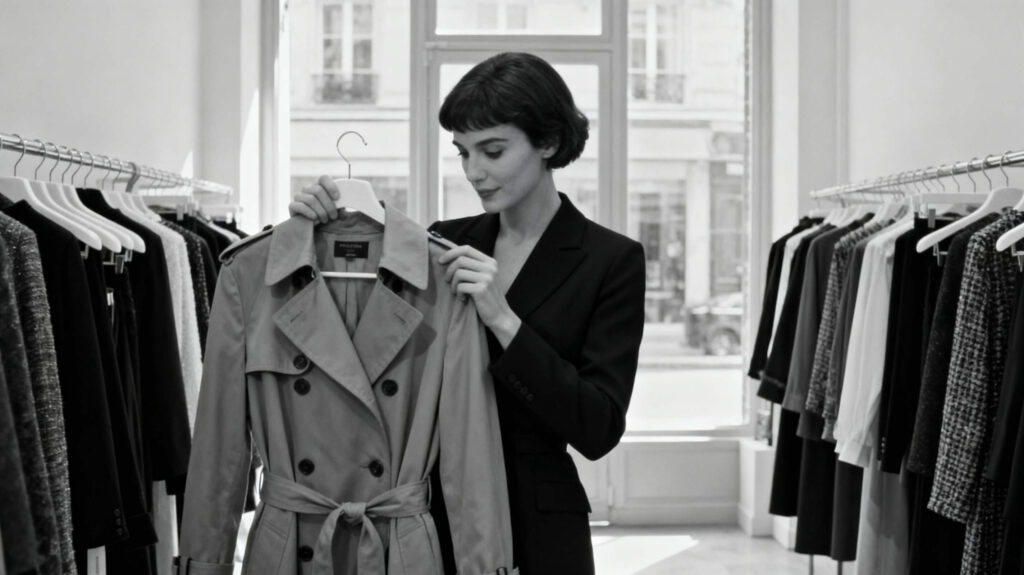
Venier Suggests: A classic Trench Coat in a neutral „stone” color is a versatile investment for you, offering a perfect balance.
Section 4: Beyond Undertones: Contrast and Seasonal Analysis
For those who wish to delve deeper, undertone is just the beginning. A more advanced concept is contrast. This refers to the level of difference between your skin tone, hair color, and eye color.
-
High-Contrast: Individuals with very dark hair and fair skin have high contrast. They look stunning in bold, saturated colors and dramatic pairings like black and white.
-
Low-Contrast: Individuals with similar hair and skin tones (e.g., blonde hair and fair skin, or brown hair and medium skin) have low contrast. They excel in monochromatic looks and soft, tonal pairings.
This explains why a bold, graphic print might look incredible on a high-contrast person, while a softer, watercolor print might be more harmonious on a low-contrast individual.
Another layer is Seasonal Color Analysis, a system that categorizes personal coloring into four seasons: Spring (warm & light), Summer (cool & light), Autumn (warm & deep), and Winter (cool & deep). While more complex, it can provide an incredibly nuanced and personalized luxury color palette.
Section 5: Building Your Investment Palette
This knowledge is your most powerful tool for building a smart, lasting wardrobe. Here is how to apply it:
1. Invest in Your Best Neutrals:
Your most significant investments—your trench coat, your tailored blazer, your primary leather handbag, your winter coat—should be in your most flattering neutral colors. For a warm-toned person, this means a camel coat instead of a grey one. For a cool-toned person, it means a navy blazer instead of a brown one. These investment fashion colors will form the timeless backbone of your wardrobe.
2. Use Accent Colors Strategically:
Use the more vibrant or trendy colors from your palette for less permanent items like blouses, scarves, or a fun clutch. This allows you to stay current and express your personality without investing heavily in a color that you may not love forever. This is the essence of building a luxury wardrobe budget that is both smart and stylish.
3. Eliminate Costly Mistakes:
How many times have you bought something beautiful on sale, only to find you rarely wear it because the color just feels „off”? Understanding your palette prevents these errors. Every designer piece you purchase will be a winner, an item that makes you feel as good as it looks, maximizing its cost-per-wear and its value in your life.
Frequently Asked Questions
Q1: What if I’m still unsure of my undertone?
A: If the tests are inconclusive, you are likely in the versatile Neutral category. You can also look at a celebrity whose coloring is similar to yours for inspiration. When in doubt, a professional color analysis can be a fun and enlightening experience.
Q2: Does black and white suit everyone?
A: Not equally. Pure, stark white is most flattering on cool and high-contrast individuals. Warm tones shine in creamier, off-whites. A deep, true black is stunning on „Winter” seasonal palettes (cool & deep), but can be slightly harsh on others, who might look better in charcoal grey or deep chocolate brown.
Q3: How do fashion trends fit into my personal color palette?
A: Use trends as accents. If the „color of the year” is a lavender (a cool color) and you are warm-toned, you don’t need a lavender coat. Instead, you could try a lavender handbag or a scarf that incorporates a hint of the color alongside your warmer tones.
Q4: Can I ever wear colors that are „not in my palette”?
A: Absolutely! Fashion is about expression, not rigid rules. The trick is to wear less flattering colors further away from your face. For example, if you are cool-toned and love a warm camel color, wear it as a pair of trousers or a skirt, paired with a flattering cool-toned color near your face, like a crisp white or blue blouse.
Conclusion
Luxury color theory is your personal key to unlocking a new level of style and confidence. It elevates fashion from a guessing game to an intentional art form. By understanding your unique coloring and building a wardrobe of designer pieces that honor it, you ensure that every investment is a wise one. Your clothes will not just be beautiful in their own right; they will be beautiful on you, creating a harmonious and radiant effect that is the true hallmark of timeless elegance. This is the ultimate power of dressing with knowledge: creating a look that is effortlessly, authentically, and powerfully you.
Ready to build your most flattering wardrobe? Explore Venier’s curated collections and discover designer pieces in your perfect color palette today.